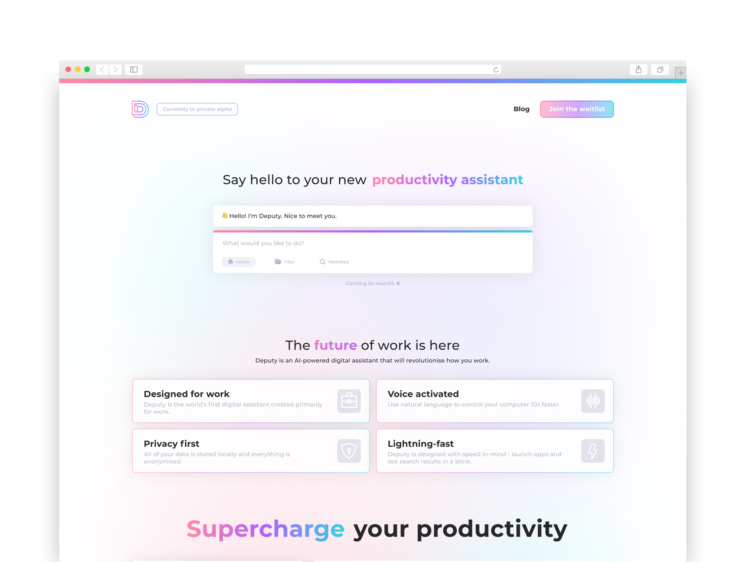
We needed a website to build up hype around the launch of the beta for Deputy. This only needed to be a landing page and a blog space. The website was going to be the place where our potential users go to sign up for the beta.
A basic wireframe created in Figma. We ended up going with the left design for the first version of the website.
The first version of the website looked like this and included this animation I created. I built the website myself using Webflow.
This was the bottom half of the website. The sign up area sticks to the bottom of the page as you scroll.
These were some wireframes created in my notebook. After doing more work on Deputy as a product, the visuals changed into something brighter and we had more we could show so the website needed to be redone.
The home page.
The blog area.
A blog post page. I created all of these pages in Webflow but the project never went live.


